How We Revamped the Zenyus AI Website — From the Inside Out
A developer's honest account of rebuilding zenyus.ai: what we changed, why we changed it, and what we learned along the way.
Most website revamps get announced with a press release and a LinkedIn post that says "we're thrilled to unveil our new look." This isn't that.
This is the honest version — what the old site was missing, what decisions we made, and what it actually took to rebuild it. No polished narrative. Just the real account of how it went.

Why the Old Site Needed to Go
The previous zenyus.ai was functional. It told you who we are, what we do, and how to reach us. But it didn't feel like a firm that builds AI-powered solutions for nonprofits. It felt like a placeholder.
For a consultancy whose entire value proposition is helping organisations move fast and think clearly about technology, that was a problem. The site was the first thing a potential client saw — and it wasn't saying what it needed to say.
First impressions in the consulting world carry disproportionate weight. A nonprofit program director researching Salesforce implementation partners is not going to spend twenty minutes on your site trying to figure out what you stand for. They spend thirty seconds. If the site doesn't communicate competence and clarity in that window, they move on. The old site was not winning that thirty seconds.
There was also a deeper issue. Zenyus AI had evolved significantly as a firm — sharper focus, deeper expertise, more defined opinions about how nonprofit technology should be done. The website hadn't kept up. It was describing a version of the firm that no longer quite existed.
Starting From the Right Question
The mistake most teams make when they start a revamp is jumping straight to decisions about colour palettes and page layouts. We made a deliberate effort not to do that.
The first question we asked was: who is actually visiting this site, and what do they need to walk away knowing?
The answer shaped everything that followed. Our visitors are typically senior people at nonprofits — CEOs, CFOs, Heads of Technology, program directors — who are either evaluating Salesforce for the first time or who already have Salesforce and are trying to figure out whether their current implementation is holding them back. They are not technical. They are time-poor. And they are skeptical of consultancies that overpromise.
That meant the site needed to do three things, and only three things: establish credibility fast, explain what we actually do in plain language, and make it easy to start a conversation. Everything else was noise.
What We Actually Changed
-
The foundation. The site was rebuilt from scratch. Not a theme swap, not a CMS migration with a new coat of paint. A full rebuild — new structure, new component architecture, new content strategy. Starting from scratch is slower upfront. It is also the only way to make decisions that are right for the site you're building now, rather than decisions constrained by the site you built two years ago.
-
Typography and visual identity. We made deliberate choices about how Zenyus AI looks and feels. The goal was something that felt editorial and considered — not another SaaS template with a hero gradient and a row of logos. Typography does a lot of the heavy lifting here. The right typeface combination signals expertise before a visitor has read a single word.
-
Performance. The old site had loading issues that were quietly hurting us. The rebuild prioritised clean, fast rendering across devices. Nonprofits don't always have the best internet connections or the newest hardware. A site that loads slowly is a site that loses people — and in a sector where trust is earned carefully, a slow site also signals something about how you work.
-
Content clarity. We rewrote the core pages — services, about, contact — to say less and mean more. Every sentence had to earn its place. If it didn't answer a question a real client would have, it was cut.
-
Animations and interactions. We added motion that serves the content rather than decorating it. Scroll-triggered reveals, hover states that feel intentional, transitions that don't slow you down. The rule we kept coming back to: if removing the animation makes the page clearer, remove it.
-
Mobile experience. The old site was an afterthought on mobile. The rebuild treated mobile as a first-class experience — rethinking layouts, touch targets, and content hierarchy from the ground up.
-
The blog. We rebuilt it as a proper editorial space — because the thinking Zenyus AI produces deserves a home that takes it seriously. Good content published on a bad template is still a missed opportunity.
The Technical Decisions That Mattered
A few choices under the hood that had an outsized effect on the outcome.
We chose a component-based architecture that makes future updates fast and consistent. When a core element changes — a card, a section header, a call-to-action block — it changes everywhere at once. This sounds like an obvious decision. It is, and yet plenty of sites are still built in ways that require manual updates across dozens of pages every time something changes.
We kept the dependency count low. Every external library we pulled in is a risk — a maintenance burden, a potential performance hit, a future breaking change. We built custom where custom was straightforward, and only pulled in dependencies where the alternative was genuinely worse. The result is a codebase that a developer new to the project can understand in an afternoon.
We also built with SEO as a structural concern, not a retroactive checklist. Page titles, meta descriptions, semantic HTML, heading hierarchy, structured data — these were built into the architecture from the start. Optimising for search after a site is built is always harder than building it correctly in the first place.
What I Learned Building It
I joined Zenyus AI as an Associate Software Developer, and this revamp was one of the first major projects I owned end to end.
The hardest part wasn't the code. The code was manageable. The hardest part was making decisions with incomplete information — choosing a direction when there were three reasonable options, shipping something before it felt finished, and trusting that iteration beats perfection.
A few things that stuck with me:
Design decisions are product decisions. Every choice about layout, spacing, or colour has an effect on how a visitor understands what Zenyus does. That's not a designer's job alone. That's everyone's job. As a developer, I had to get comfortable having opinions about things that weren't strictly engineering problems.
Speed of feedback matters more than speed of output. I could build features fast. What slowed me down was not getting feedback fast enough. The revamp got better every time someone looked at it with fresh eyes and said "this part doesn't make sense to me." Building in isolation for too long is a trap. Get work in front of people early, even when it's not ready.
Ownership is a different kind of pressure. When it's your project — not a ticket assigned to you, but something you're responsible for end to end — you think differently about it. Every detail matters because you can't pass it off to anyone else. That pressure is uncomfortable and it's also what makes you better.
The brief will change. Requirements that seemed fixed at the start shifted as the project progressed. Pages that were in scope became out of scope. Features that weren't planned became important. The ability to absorb scope changes without losing momentum is as valuable as any technical skill.
Done is a strategy. There were parts of the site I wanted to spend another two weeks on. At some point you have to ship. A live site you can iterate on is worth more than a perfect site that never launches.
Where It Stands Now
The revamped zenyus.ai is live. It's not finished — no site ever really is — but it's representative of who we are and what we're building.
The feedback since launch has been direct: the site is clearer, faster, and more credible than what we had before. That was the goal. We hit it. There are things we'll iterate on over the coming months — there always are — but the foundation is solid.
If you're reading this and you work at a nonprofit that's thinking about AFNP, Agentforce, or Salesforce more broadly: take a look at zenyus.ai. The site now actually reflects the quality of work we do.
And if you're a developer who's about to take on a project like this for the first time — it's worth it. Even the parts that are hard, especially the parts that are hard.
Yashraj Singh Chauhan
Yashraj Singh Chauhan is an Associate Software Developer at Zenyus AI — a Salesforce consulting firm working exclusively with nonprofits and public sector organisations across Australia.
Ready to Transform Your Salesforce Strategy?
Let our Certified Technical Architect guide your digital transformation with proven expertise.
Related Articles
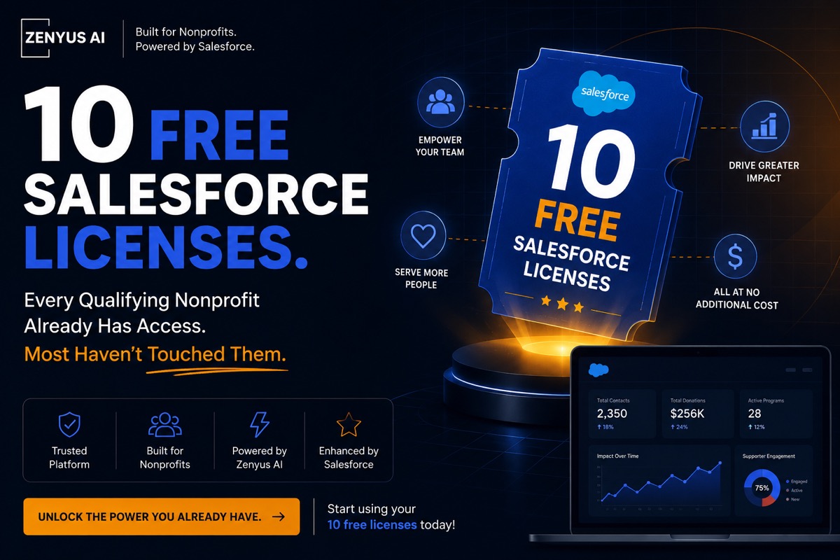
10 Free Salesforce Licenses - Potential of Salesforce “Power of Us” Program.
Salesforce offers 10 free Enterprise licenses through the Power of Us program, yet many nonprofits aren't leveraging this power. Here is why you should pay attention.
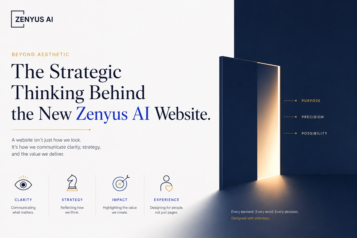
Beyond Aesthetic: The Strategic Thinking Behind the New Zenyus AI Website
How branding, UI/UX, digital psychology, and perception design shaped the rebuilding of Zenyus AI’s online identity.